Enhance your design with 4 principles
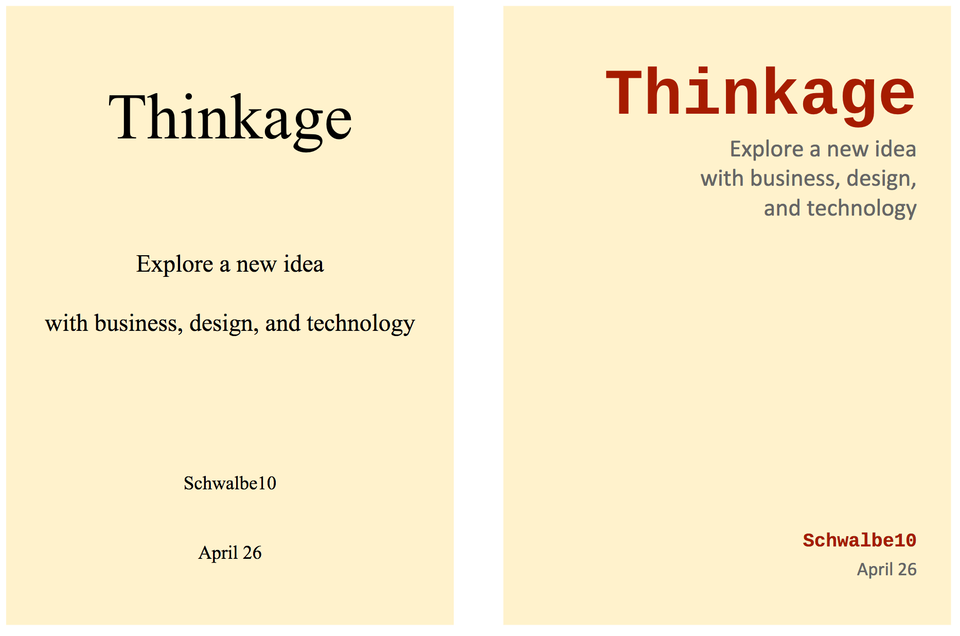
Please look at two covers below. What is the difference between them? The right one is in line with the 4 basic principles of design, but the left one is not. Today, I illustrate the principles—Proximity, Alignment, Repetition, and Contrast—according to The Non-Designer’s Design Book.
Proximity
Group related items together … physical closeness implies a relationship.
Items in physically close to each other are seen as one cohesive group. (It is a different concept from proximity of Gestalt principles.) Elements of information that are not related should be placed separately.
The title and subtitle on the right cover are put together and it means those two topics are closely connected. We can read and remember information easily if several units are organized by proximity.
Alignment
Nothing should be placed on the page arbitrarily. Every item should have a visual connection with something else on the page.
Aligned items generate a cohesive unit. Alignment imparts an invisible line that connects them. Even though they are not approximate, we can consider them as the same piece.
Both of the covers are aligned—the left one is a centered alignment and the right one is a flush right. A flush left or flush right alignment gives a stronger edge and sophistication.
Repetition
Repeat some aspect of the design throughout the entire piece.
The same elements of fonts, colors, formats, etc. also indicate their relevance. If a brochure has the repetition of certain elements, it keeps a consistency. If some objects have the same color, we feel more organized.
The typeface and color is repeated in the title and the author on the right. Compared to the left one, relationship between them is more clear. It strengthens their consistency and connection.
Contrast
Contrast various elements of the piece to draw a reader’s eye into the page.
You can use it to draw an eye, guide a reader, and provide a focus. Contrast should be cleared because minor difference leads to conflict. Even though two newsletters have the same information, it is possible to attract more people by contrast.
The dark red font has a role of contrast as well as repetition. Readers can recognize the title at a glance. There are many ways to contrast elements effectively. For example, you can highlight them by characters on a colored background.